Brand Accessibility
Brand Accessibility
CEB, now Gartner, 2106
We received feedback from our users concerning CEB’s branding and how it needed to be compliant with the latest web accessibility guidelines. To test for compliance, we ran a design audit of the brand’s application on CEB’s web properties and proposed solutions to make all content accessible to users.
Overview
Problem
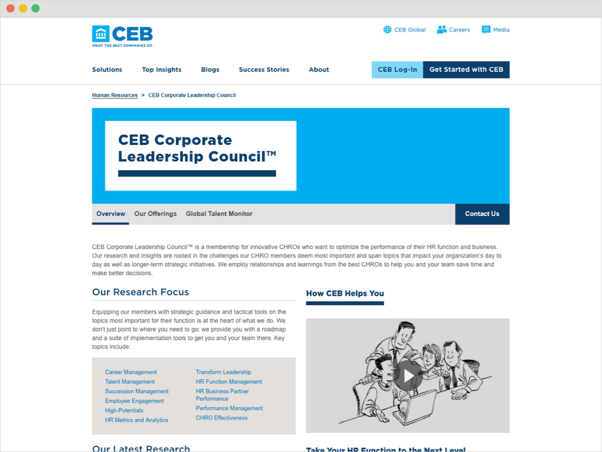
CEB’s rebrand had a vibrant color palette that brought new life into its research-driven practice. This color usage, however, did not translate well in web applications and left much of CEB’s content inaccessible to users. For instance, many of the interactive elements lacked visual contrast and used unreadable color combinations.
Solution
We needed to identify any visual elements and components used on CEB’s website that were not Level AA compliant according to the Web Content Accessibility Guidelines (WCAG). Items that failed these guidelines, and were critical to user interaction and access to content, would be redesigned to be AA compliant or better.
My Role
I executed a visual design audit to test for CEB’s brand accessibility on the web, documented the results, and proposed design solutions for components found to be inaccessible to users.
Project Note
While working on this project, another party was involved with identifying accessibility issues in the code on various CEB platforms. Any problems found here could make using assistive technologies, like screen readers, hard or impossible to use while navigating the web.
Methods and Execution
Visual Design Testing, Visual Design
- Used the Web Content Accessibility Guidelines (WCAG) to determine which rules we needed to follow to identify design issues. Many of these guidelines are in the perceivable category.
- Performed an audit of all visual elements across CEB’s web properties, which included its global website, event pages, and other microsites.
- Used webaim.org, specifically the color contrast tool, and various browser extensions to test the visual contrast and color usage on a webpage.
- Documented the results in a Google Spreadsheet.
- Designed accessible solutions in Photoshop CC.
- Collaborated with multiple design teams to determine the best solution for each failed element and component outlined in the test results.
Process
I began this project by becoming more familiar with the WCAG and what it meant to be compliant with their guidelines. For this particular audit, we had to make sure the visual design of our web elements and components were at least Level AA compliant. Our primary focus was on the contrast, color use, and overall visual clarity of the design. With this in mind, I documented which elements did not pass our audit.
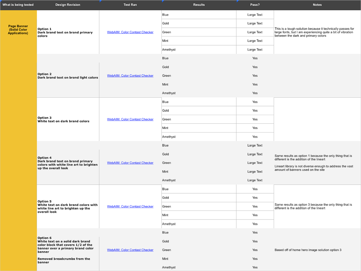
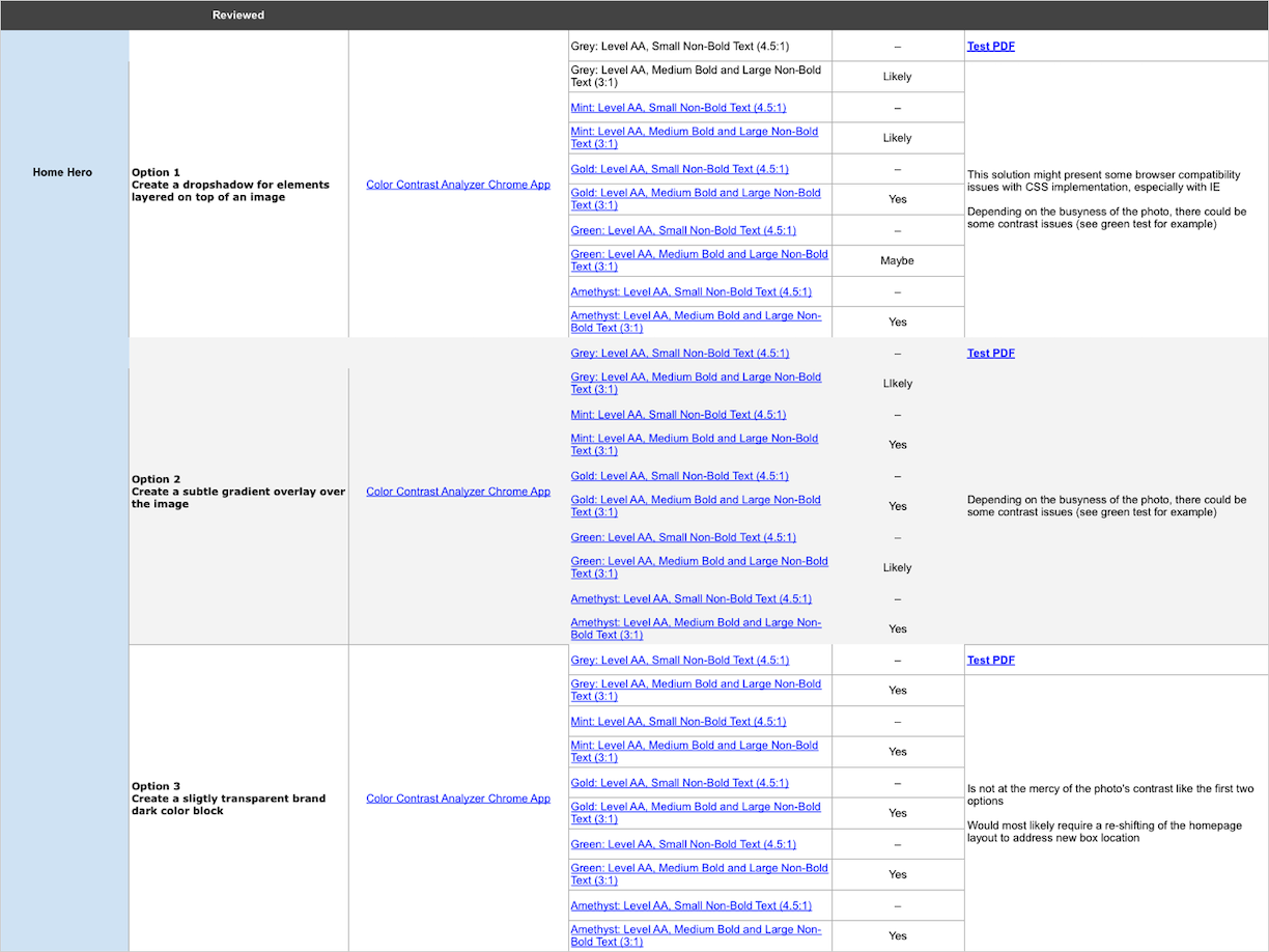
The design audit required a few different types of documentation. A spreadsheet was created to be an aggregate for all the tests and provide quick access to the results. Various pdfs were created to document the assessment details.
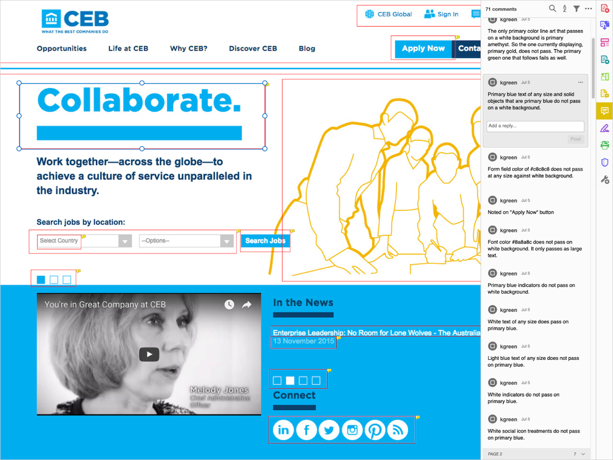
After the audit was complete, I started to work on solutions for the failed designs. An example of a solution is: when we used a blue font that did not provide enough contrast against a white background, we needed to either make the text darker or change the background color. Most of our problems were related to this particular issue. We also needed to consider how readable text was when placed over an image with specific color overlays.
Throughout this process, I collaborated with the rest of the design team to determine the best solution for each component. One of the biggest challenges was staying within CEB’s established look-and-feel. A prevalent solution was to use a darker color which added weight to the design that was not present before. Working as a team, we picked and iterated on the best options that stayed as true to the brand as possible.
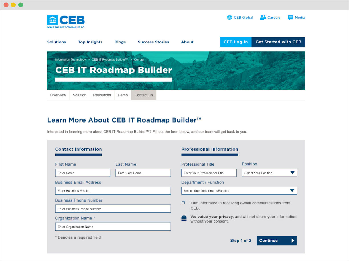
Original Form
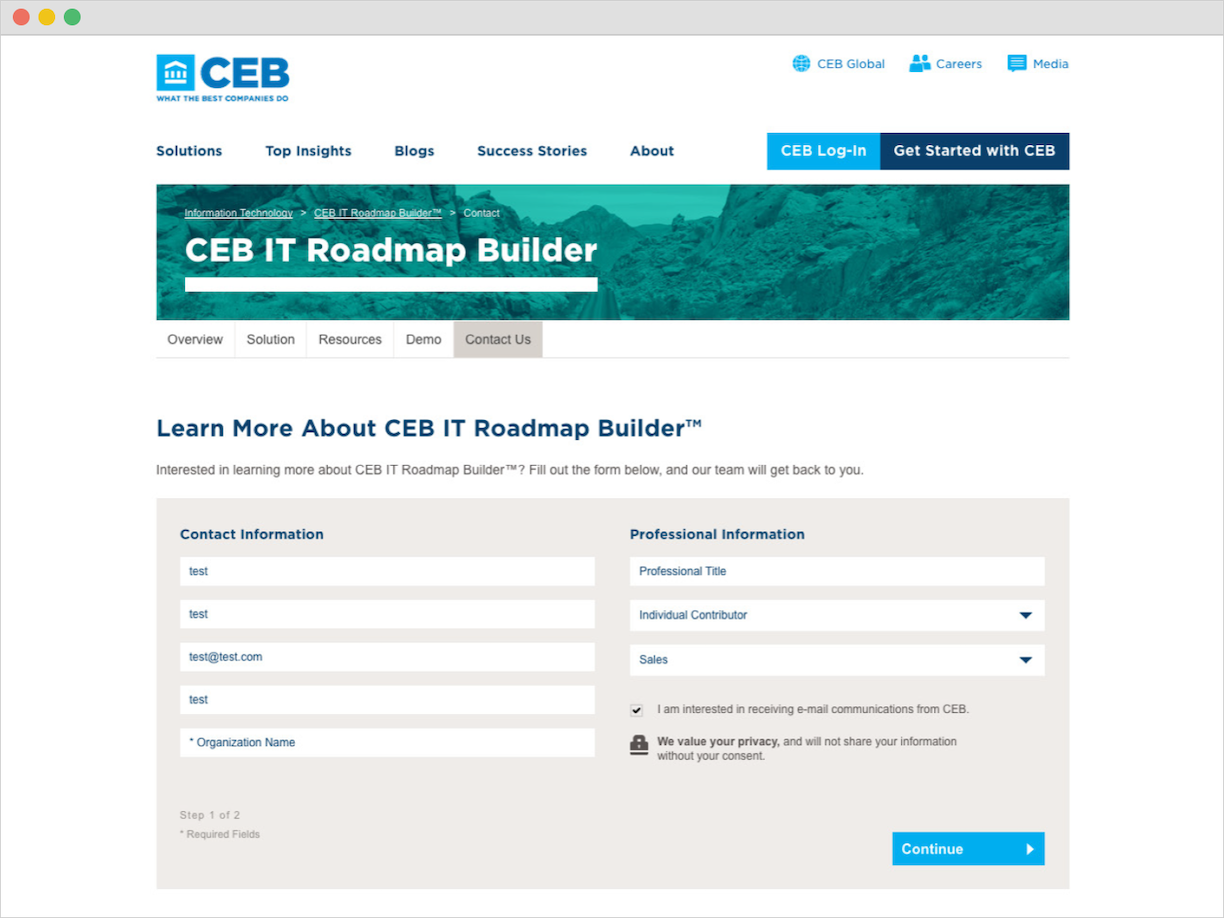
Form Solution
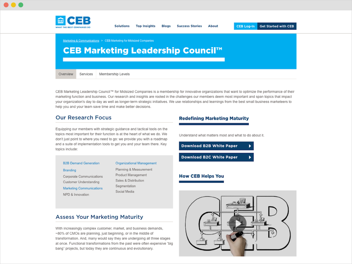
Original CTA Button
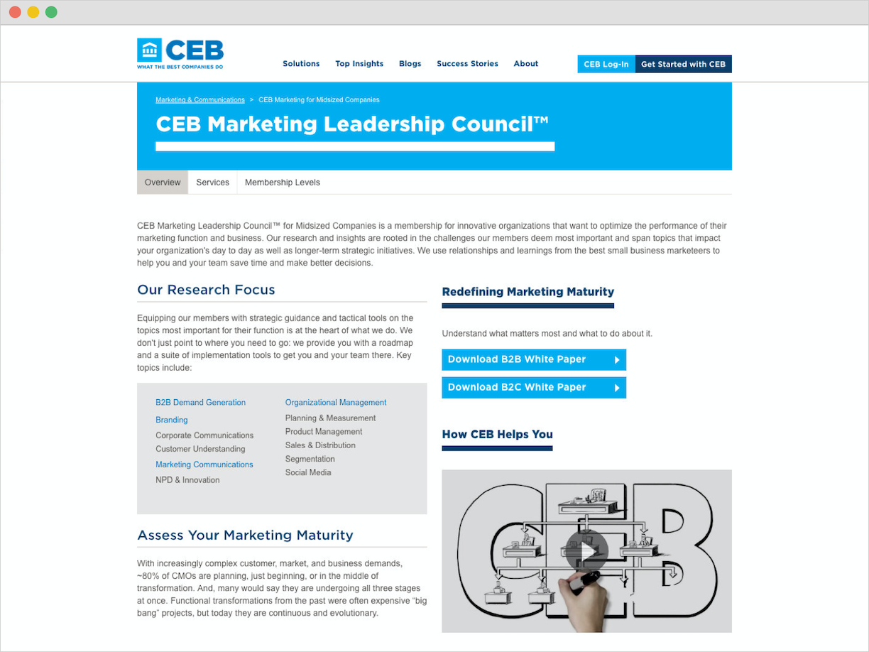
CTA Button Solution
Original Page Banner and Secondary Navigation
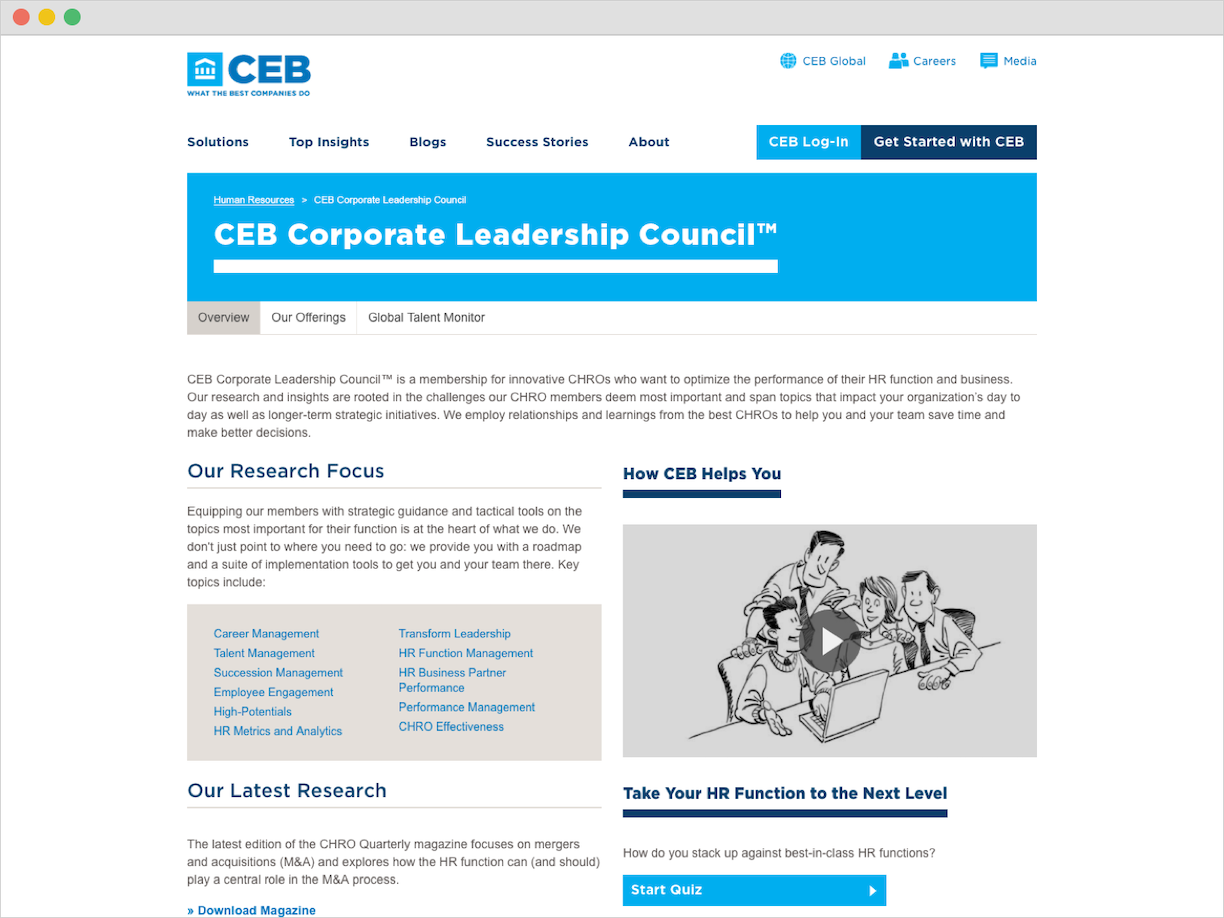
Page Banner and Secondary Navigation Solution
Towards the end of this project, we would pause progress due to the call to completely redesign CEB’s website. The work done for this project would not go to waste, however. Many of the concepts I developed were implemented in the redesign and went live several months later.