Data Visualization
Data Visualization
Gartner, 2017-18
TalentNeuron is a top source for talent-related data, but many of its users were not able to get the most out of its data. That discovery pushed us to explore how we provide and display data throughout the platform.
Overview
Problem
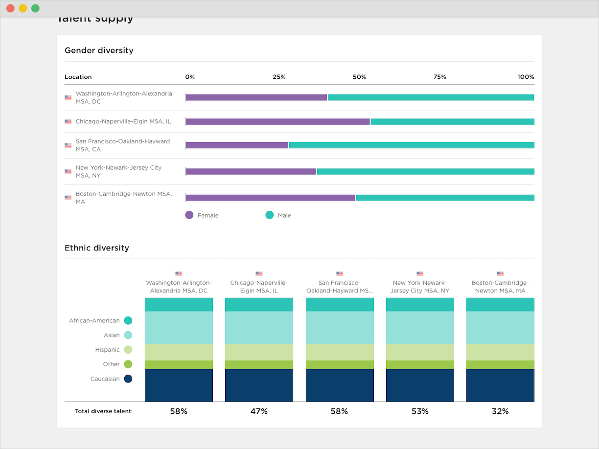
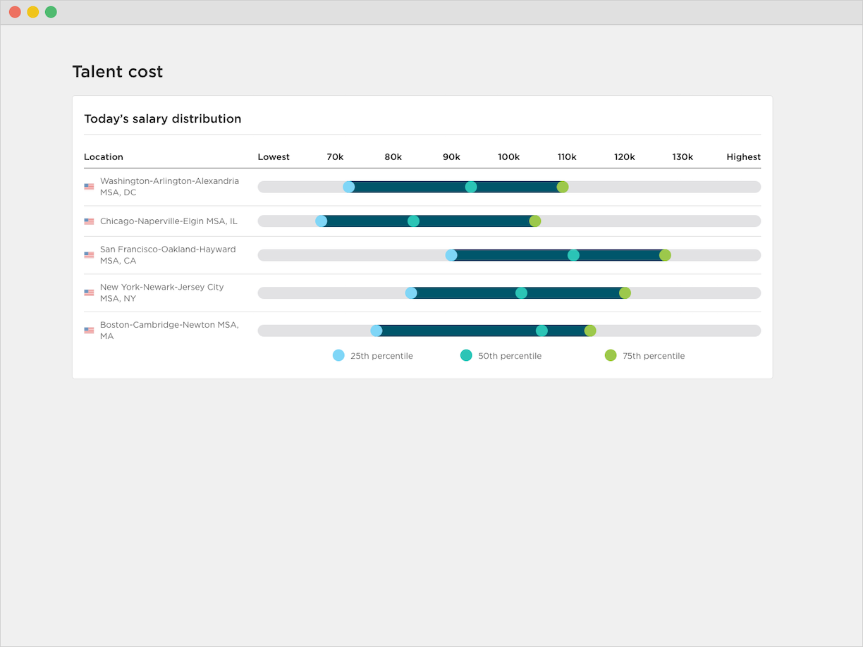
After consulting with our customer support team, we identified that TalentNeuron’s visualizations either felt incomplete to our users or were difficult to understand. That meant many of our users needed additional instruction on how to use and interpret the platform’s data– taking up valuable time from both our users and our team.
Solution
Create and develop data visualizations that are easy to understand and filter, while offering users the flexibility to use them for internal documentation that would drive data-backed talent decisions.
My Role
I developed working prototypes, conducted internal UX testing, consulted with Data Science and Development to test for backend feasibility, and designed the UI.
Methods and Execution
User Experience Design, User Interface Design
- Identified user needs through user feedback collection and analysis.
- Collaborated across multiple teams to develop executable solutions. The teams involved were Customer Support, Data Science, Product, IT/Development, and UX/Design.
- Conducted internal user testing, which included experienced and inexperienced users.
- Developed wireframes and prototypes using Axure RP 8.
- Designed the UI in Sketch.
- Uploaded the UI to Zeplin.io so we could share design specs with the development team. We also used this platform as a communication tool for any questions concerning the design and its implementation.
- Utilized Jira to keep track of story and sprint progress. This project spanned across many sprints and, true to Agile, additional requirements and design changes were added when we learned more about our users.
Process
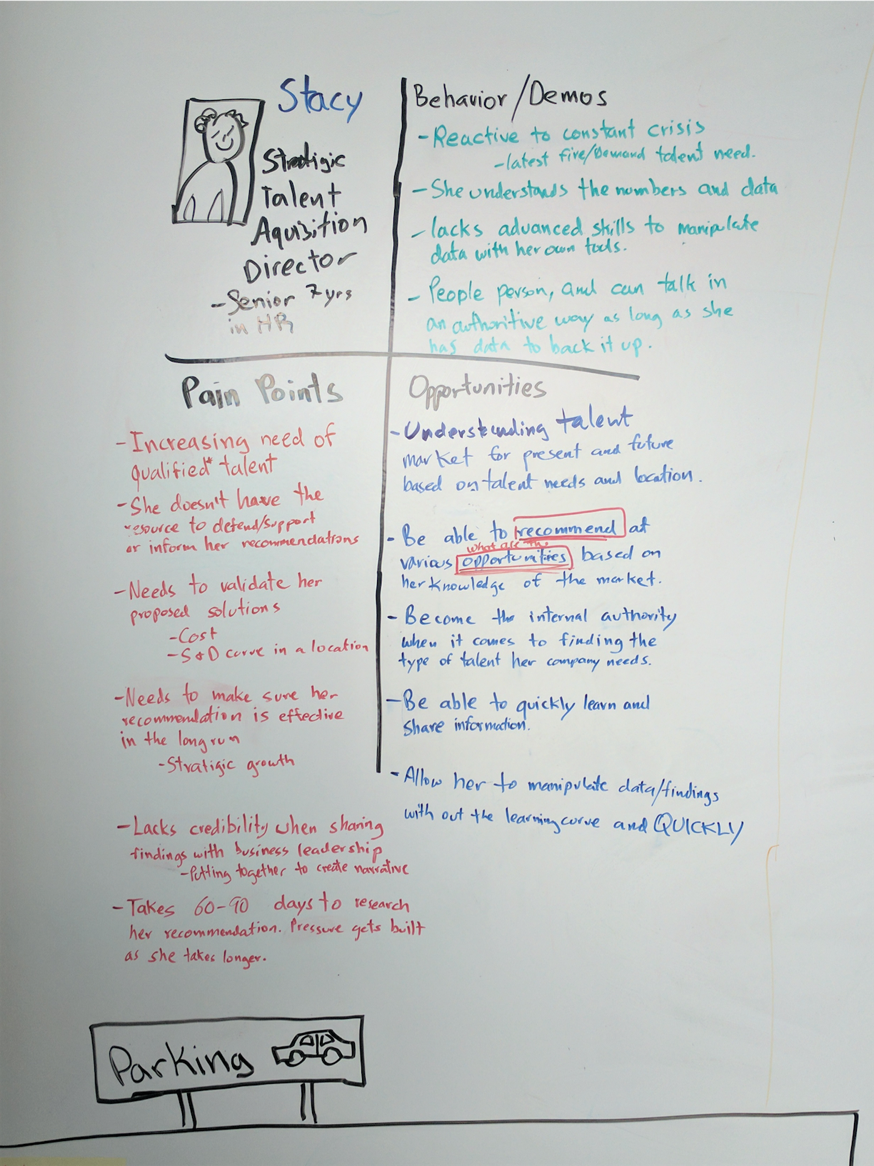
To kick-off this data visualization project, the UX team hosted a handful of workshop meetings with Product and several subject matter experts across our team to ensure a more well-rounded perspective on concepts. A primary goal of these meetings was to identify our target users and how TalentNeuron helped them achieve their goals. We also brainstormed on how to use our data to serve these goals better. Many of the target users we identified during these meetings would become proto-personas. To learn more about how we developed our personas, take a look at my TalentNeuron Personas project.
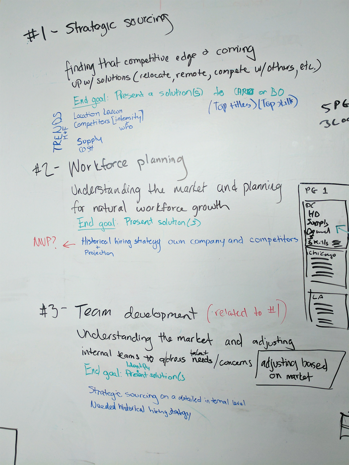
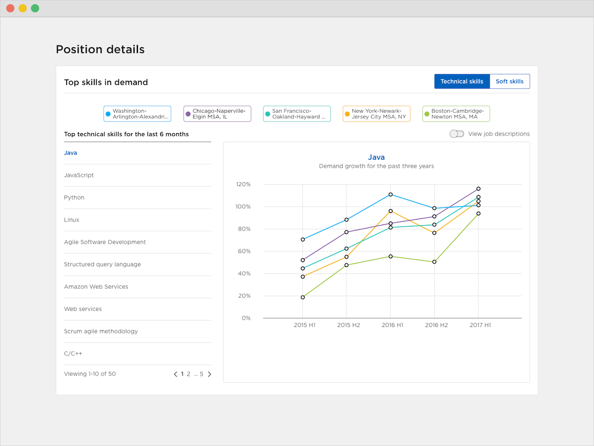
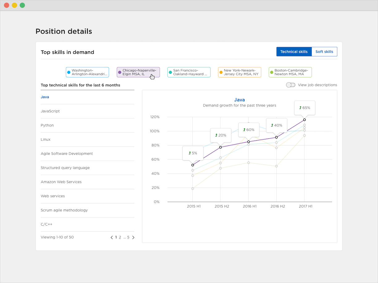
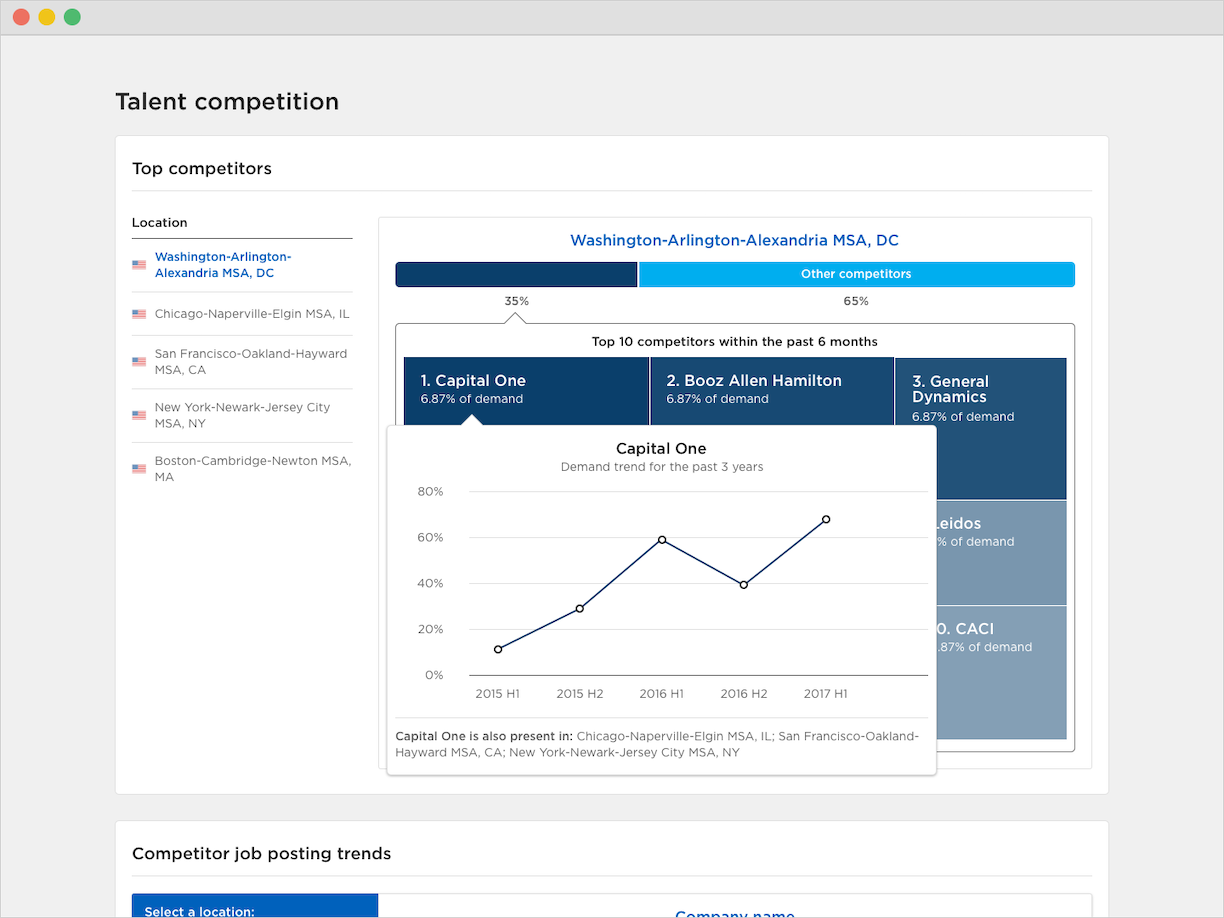
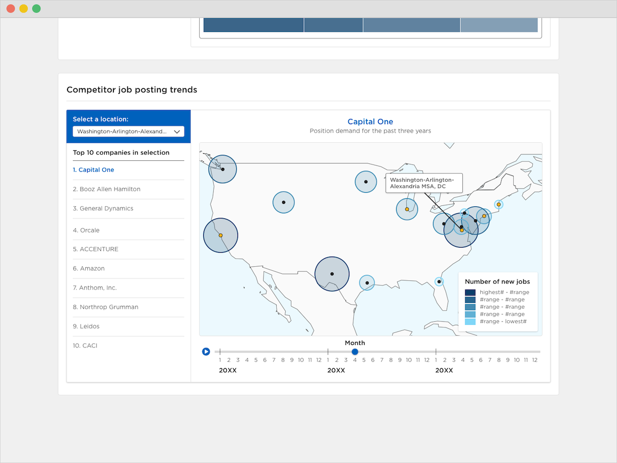
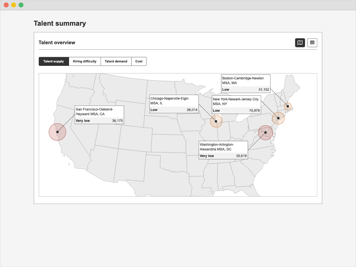
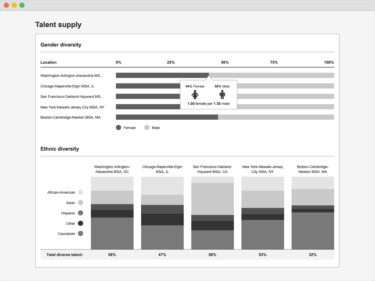
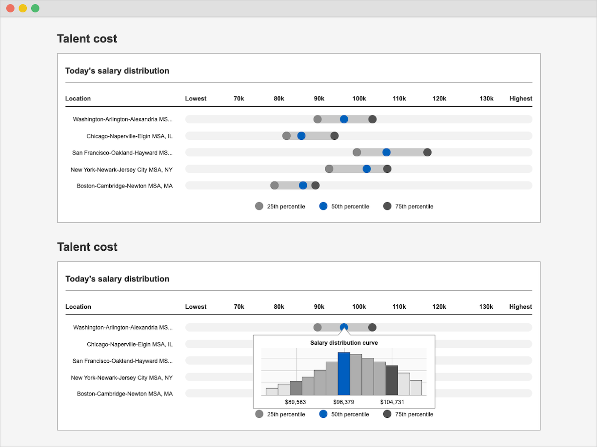
The concepts we developed during our workshops gave us a clear idea of what we needed to do for TalentNeuron. The data we used on the platform had to be displayed clearly. The UX and product teams worked together to create visualizations that best presented the data and made it easy to understand. These visualizations would be presented in a widget experience which allowed users to interact with and download the data when they needed to. The wireframes and prototypes created throughout this process explored both the functionality and basic look-and-feel of these widgets.
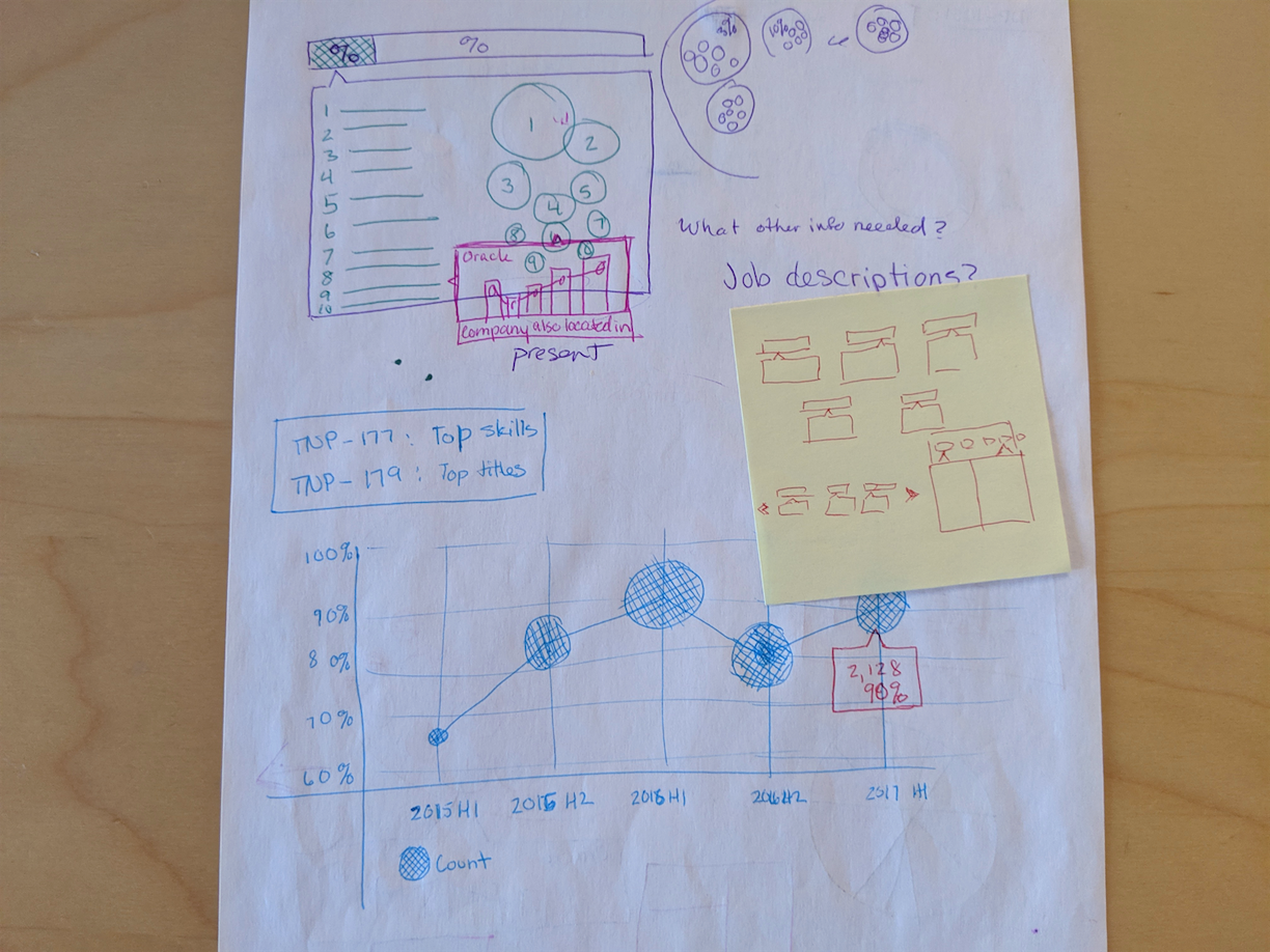
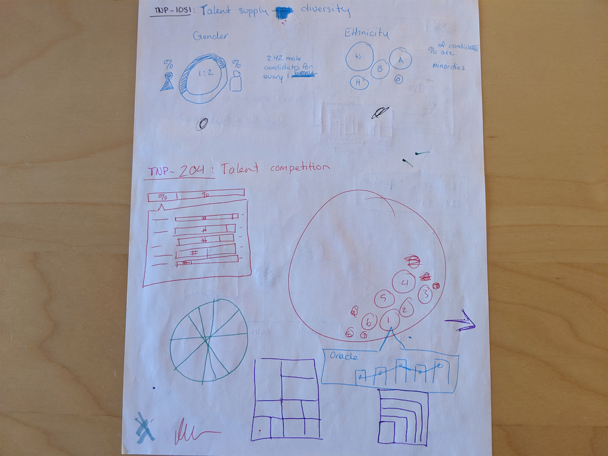
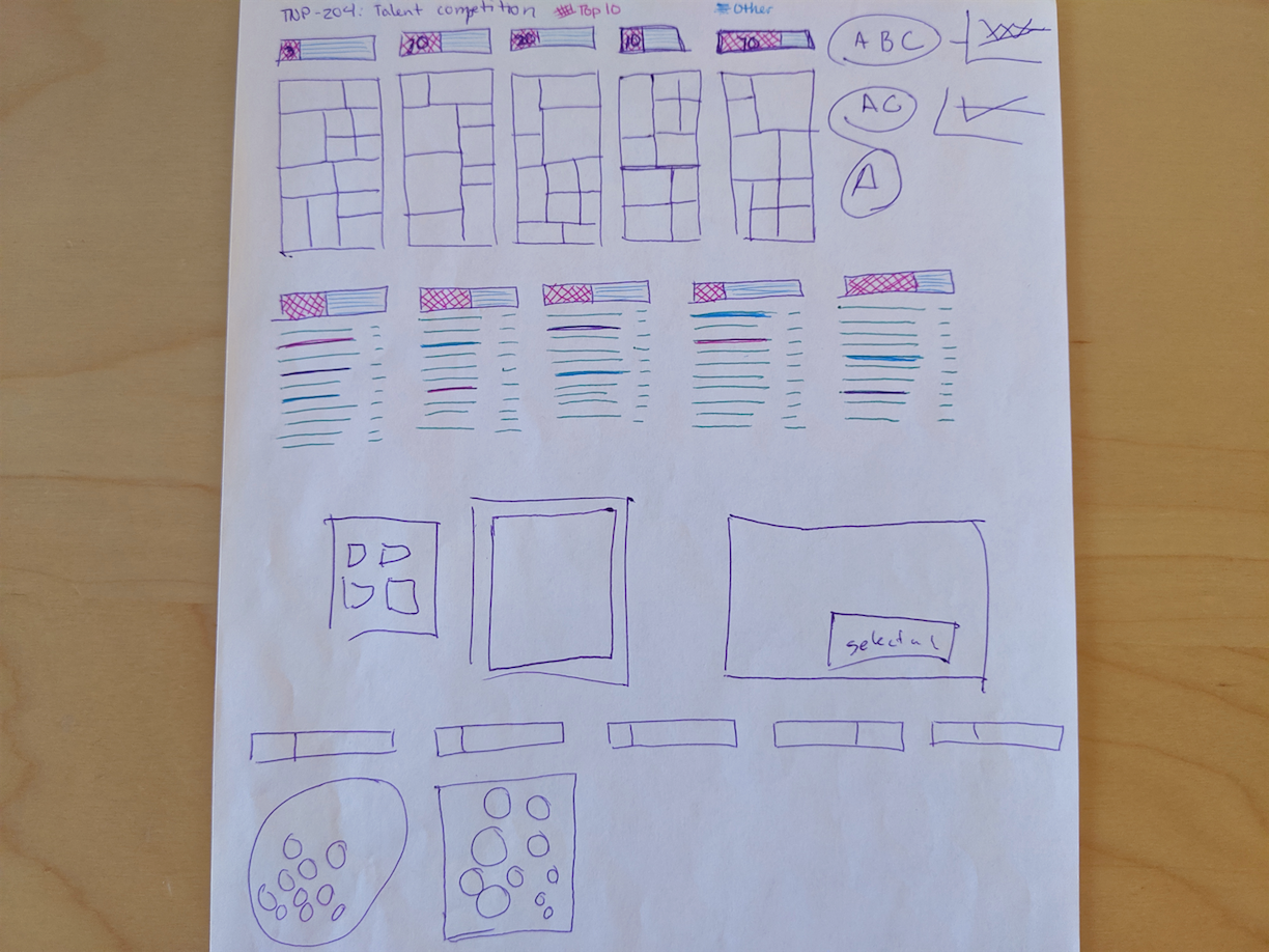
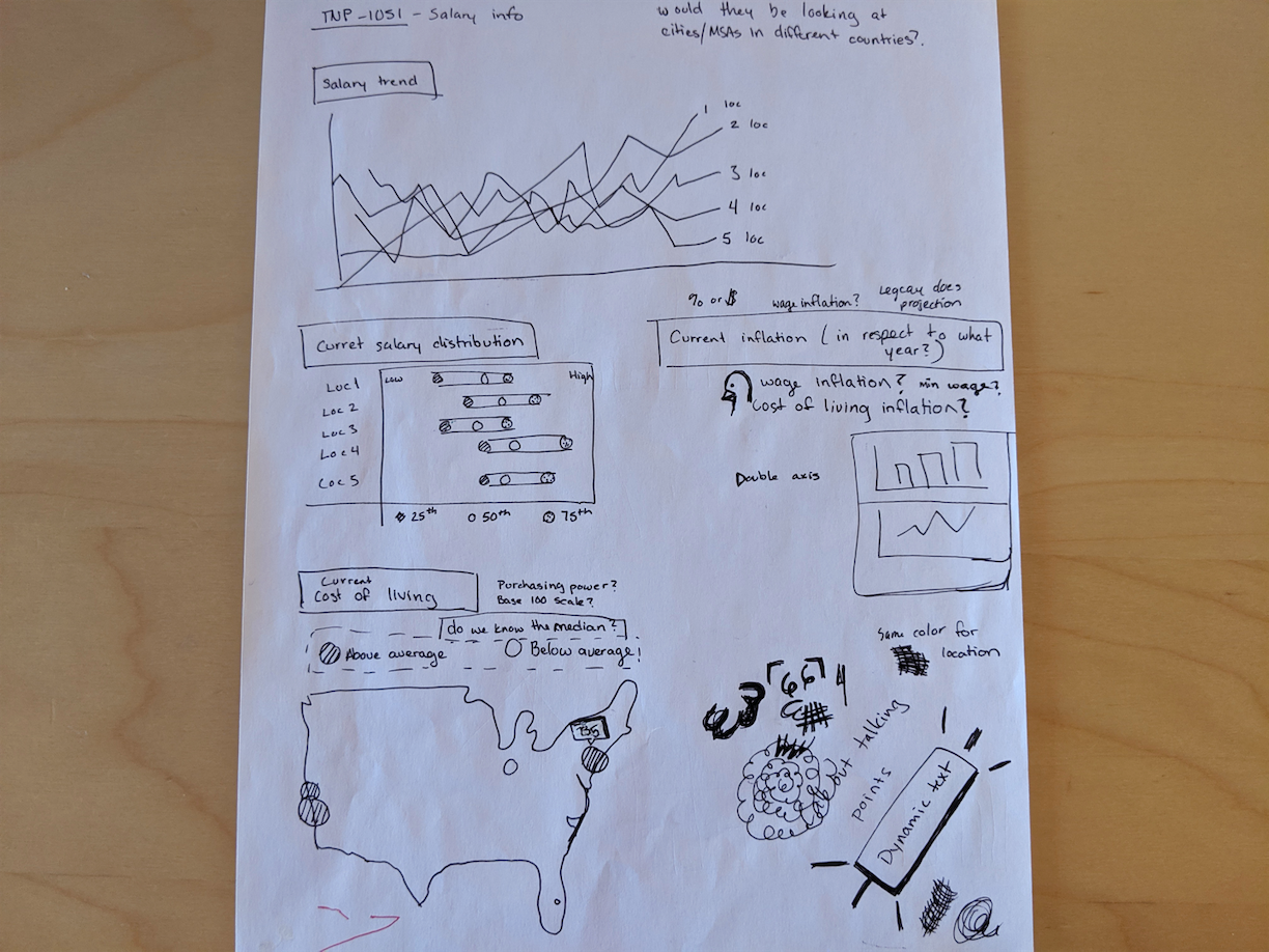
We shared all wireframes, prototypes, and other WIPs to the data science and development teams to discuss viability and usability. This process allowed us to get the OK before finalizing concepts because we got approval from the two teams essential to its development. It also allowed us to get expert advice on how the data should be read or communicated and how complicated the build might be, which gave us insight on how long it would take to develop.
Using Axure RP, we created various wireframes and prototypes of the graphs before sharing them with the team and conducting testing.
Additionally, we tested our prototypes with internal stakeholders across the team. They gave us feedback on what functionality was useful and what they thought could be done better based on what they knew about our users. We iterated on our concepts based on the responses we received and worked on the UI in Sketch for the final designs. During this time, our team did not have a formal research practice that regularly talked to users. We would, however, develop one in the coming months, and many of these widgets would go through that process (more on that soon).
When all of the designs were complete, we passed the specs to the development team using Zeplin. We continued to work with the dev team during implementation by making sure any issues that emerged were solved without requiring excessive development effort or redesign from our end. That included keeping the users’ needs first in any problem discussion.
Unfortunately, due to a restructuring of our product goals and timeline, many of the widgets we worked on did not get published on the platform right away. We saved them in our design and dev library so we could use them in the future. The major win for this was: when we identified a need for them, we were able to pull them out and test them with users as a part of the user research practice we built after this project. That enabled us to test our user experience and design firsthand with users and verify their effectiveness. It also allowed us to gather data on our users, which lead us to make more accurate hypotheses when creating widgets and other features for the product.