RecruiterNeuron Redesign
RecruiterNeuron Redesign
Gartner, 2018
RecruiterNeuron, a prominent tool within the TalentNeuron suite, was heavily used by its large client pool but received its fair share of user critique. We analyzed this feedback to create an experience that made RecruiterNeuron more accessible to its users.
Overview
Problem
Our users frequently gave us feedback on two aspects of the RecruiterNeuron tool: the search experience and data visualizations. They felt creating a search was cumbersome and new users, in particular, had issues navigating through its user flow. Users also found the data visualizations unhelpful because they did not display the results effectively, so they were unsuitable for their reports and other documentation.
Solution
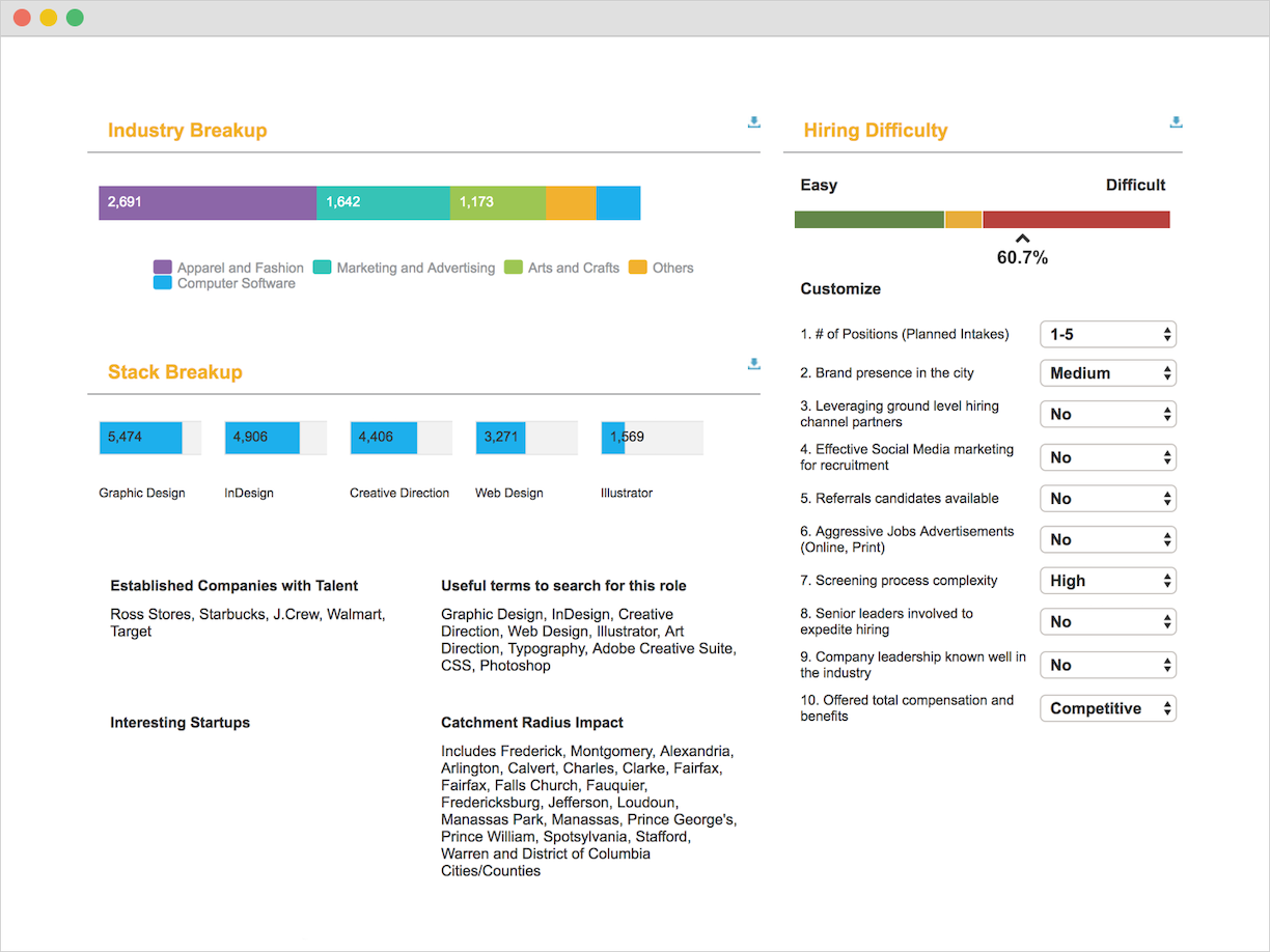
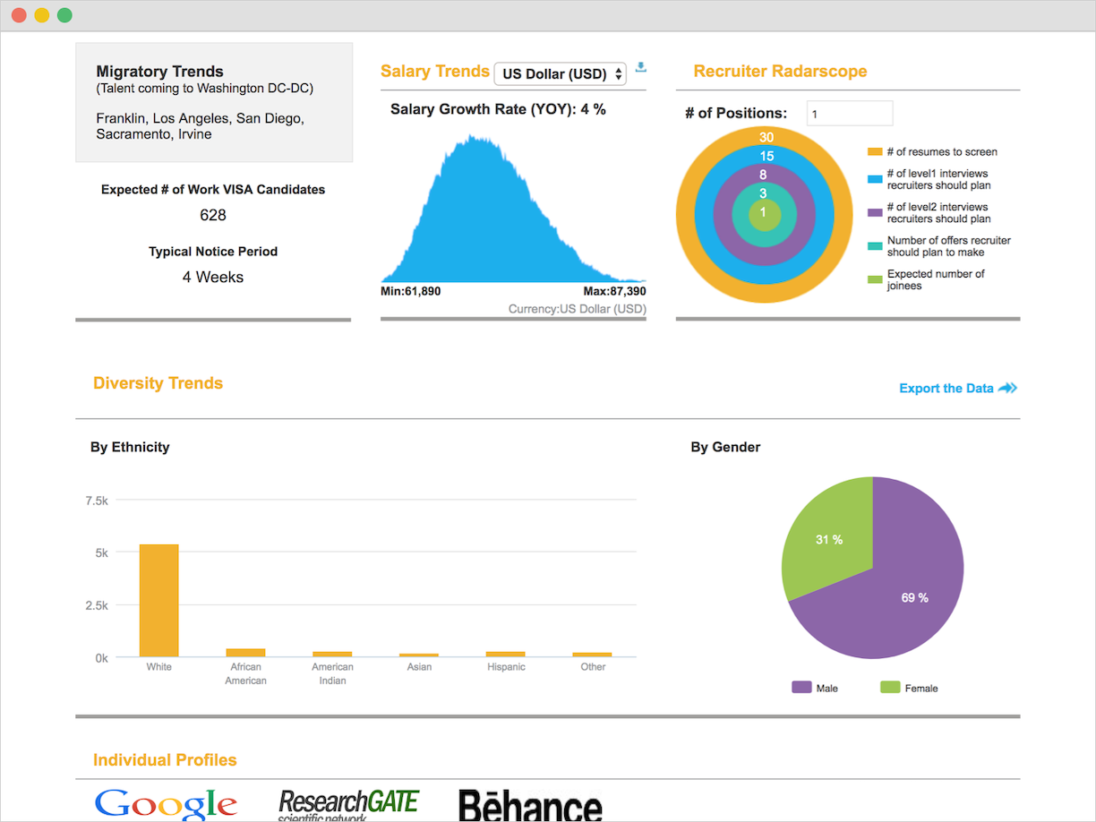
Make the search easier for users to learn and utilize so they can quickly gather data for their analyses. The data visualizations also needed to be redesigned to make the data easier to understand. These new visualizations would allow users to confidently add them to any documentation they may need to create.
My Role
I collected internal user data from various team members, provided analysis alongside the product team, created prototypes and mockups, and designed the updated user interface.
Project Note
This project was the catalyst that highlighted our growing need for a formal research practice that interacted with users directly. We began building our practice about a month later and would start interviewing users every 2-3 weeks, depending on what the project needed.
Methods and Execution
User Experience Design, User Interface Design
- Utilized user data and feedback to identify the core problems users had with the tool.
- Collaborated across multiple teams to develop an executable solution. The primary teams involved were Customer Support, Product, IT/Development, and UX/Design.
- Used Axure RP 8 to develop prototypes for the search experience and its behavior.
- Conducted internal user testing with colleagues that knew our users and were acutely familiar with their needs and concerns.
- Designed the user interface in Sketch.
- Shared designs with the development team in Zeplin.io.
- Maintained and updated user stories in Jira.
Process
We collected user data from various people within the TalentNeuron organization and used it to determine what exactly users were having difficulty with in regards to RecruiterNeuron’s search experience.
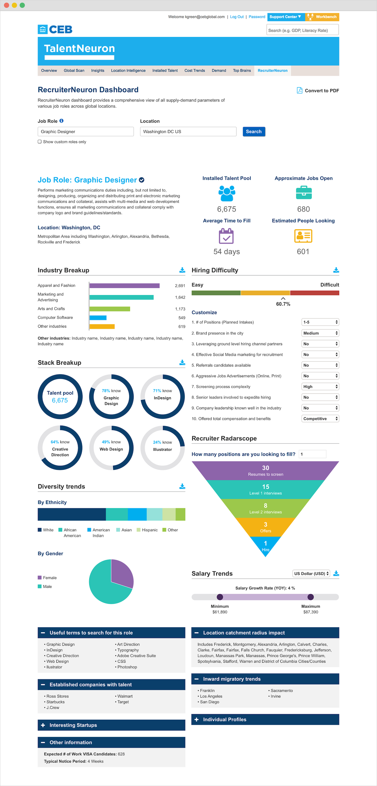
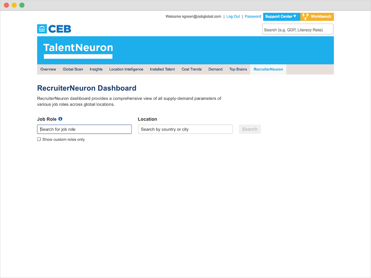
Fundamentally, the search experience was not a search; it was just a series of dropdowns that users had to navigate through so they could select what location and role they needed to analyze. That made collecting data difficult, especially if the user was running more than one query. Additionally, the search flow was one-directional. The user had to begin with selecting a location before they could choose a role. That did not cover users that were more focused on a role-based search and considered location selection secondary.
The original search required more steps than needed and confused new users due to how difficult it was to navigate through. Many users also found the data visualizations hard to read and unappealing.
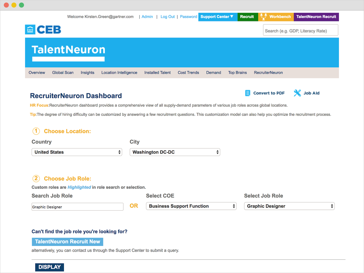
With these findings, we knew that we needed to create a flexible search that worked with either location or role as the first input. We also wanted to make the selection process easier for the user by removing the dropdowns and replacing them with a search bar that had autosuggest functionality (or a datalist for development context). This would allow the user to quickly find what they need to search for by directly entering in their input.
Throughout this process, UX, along with Product, collaborated with the development team to come up with solutions that were practical from a development perspective. For this project, in particular, we needed to include Development from the beginning. Since RecruiterNeuron was an older product and had a complex backend, we needed to fully understand what we were working with to make the most feasible solution for both the development team and our users.
Once we were confident with the initial solutions we prototyped, we ran user tests with the team. We went through several rounds of iterations to fine-tune the search’s functionality and identified any other concerns that might come from our users. When we finalized the prototype, we began designing the user interface along with the new data visualizations and prepped it for development.
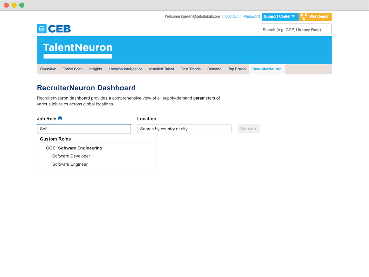
After we launched the new RecruiterNeuron experience, many of our users were ecstatic for the update and received it well. There was, however, a section of our userbase that used the search experience in a way that we did not initially identify and the update completely broke their use case. These users would select a location and then run a search for every role available for that location. That meant these users used the dropdowns to know all of the options available to them and didn’t have one particular role in mind. With the new update, we removed this capability by hiding all options until the user triggered autosuggest through adding input.
We moved quickly to address this issue by allowing all options to show for the second item users would input in the search. For example, if a user inputs a location first, they would see all of the roles available for that location under the role input field. They would still be able to type in the field to narrow down their options if they wanted to see something specific.
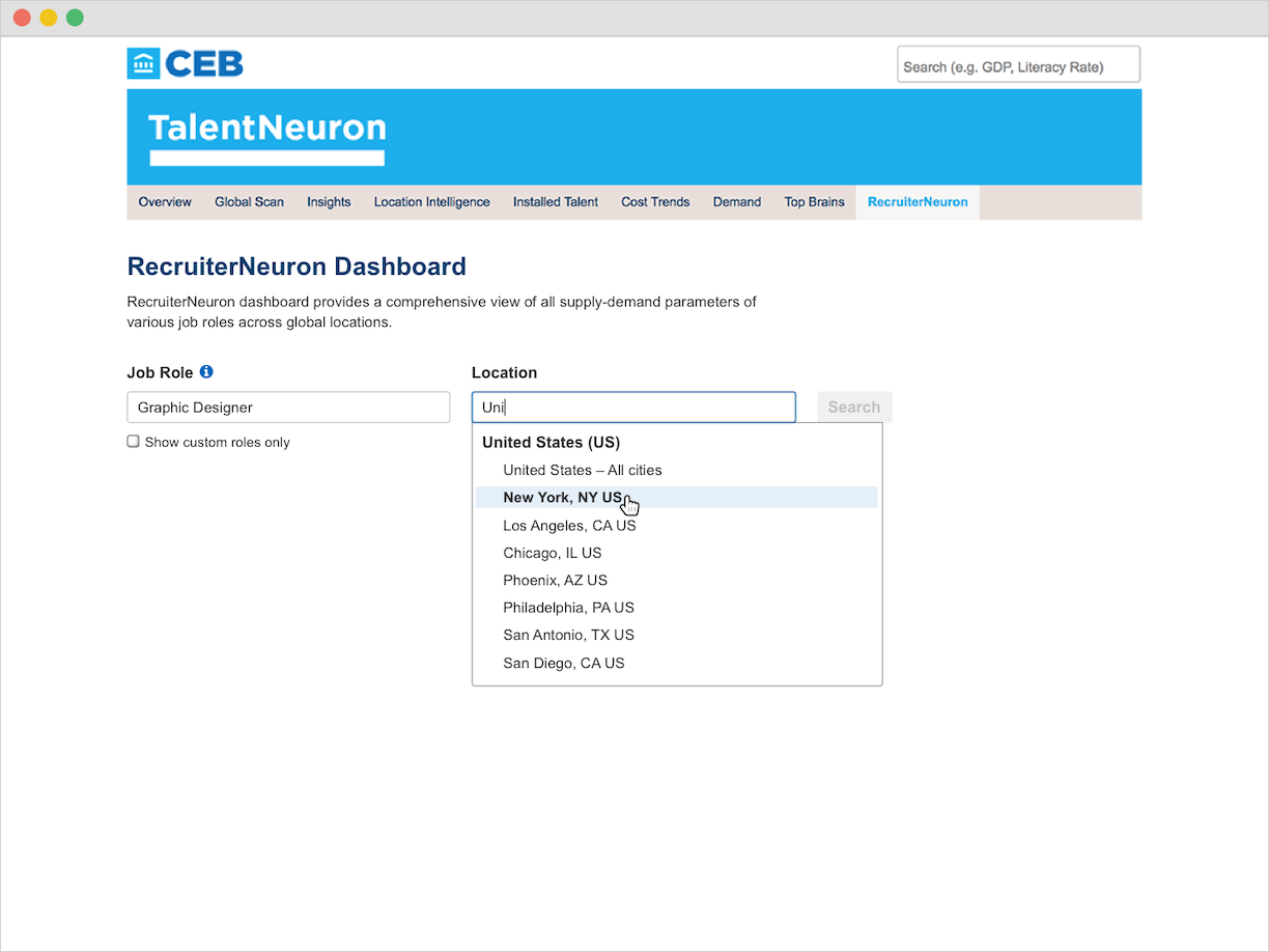
The revised search allowed users to view all options in the dropdown once they filled in one of the search fields. It also used predictive text to narrow down their options if they knew what role or location they were searching for.
Thankfully, we were able to address this issue quickly by pushing the changes during the next sprint cycle. This event was a tremendous learning experience for the team and brought to light how much we needed a research practice to understand the full scope of our users’ needs. In the coming months, we built out that research practice and began interviewing users regularly. Our process became stronger and more attentive to our users, creating experiences that served them better from the start.